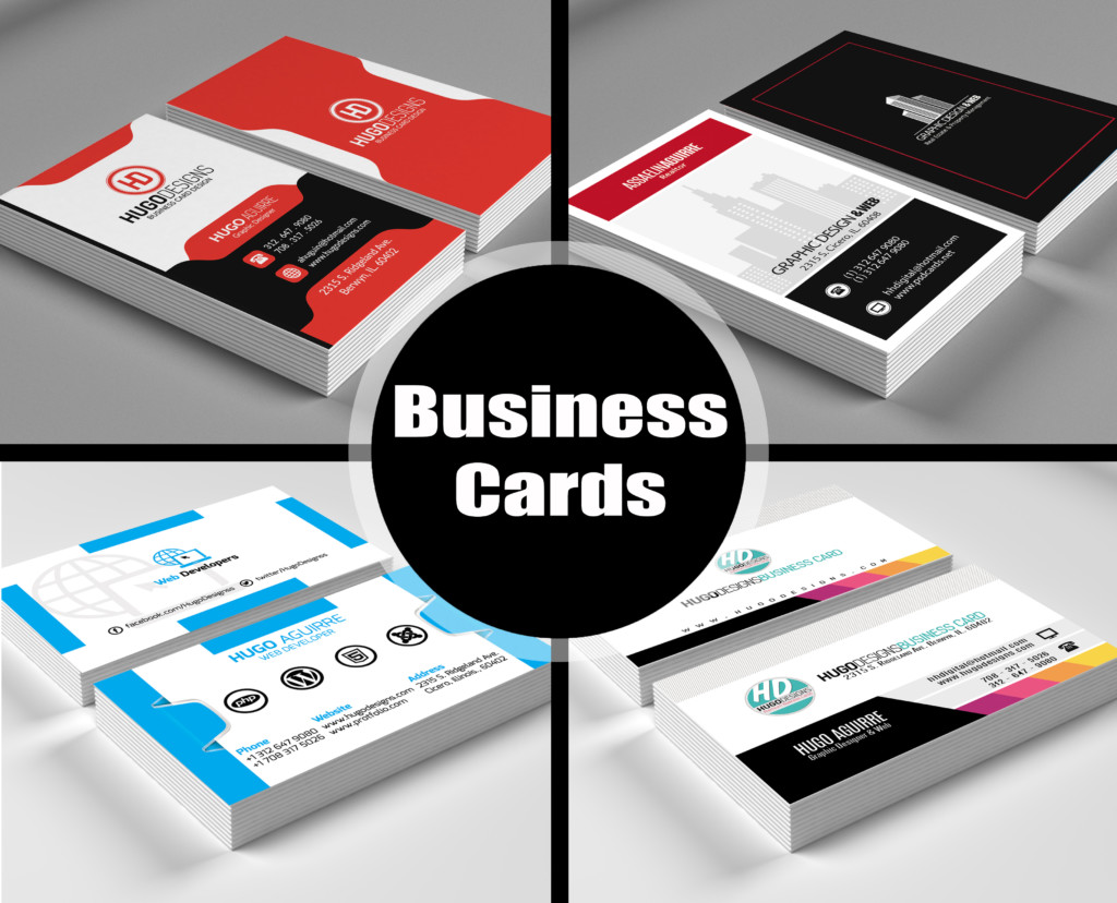
Business Cards categorized in various shapes and sizes. Usually Medium size is used for sharing contact information and they are extremely delicate work of art. Some factors should be considered when designing your business cards. The most two factors are human and machine readable of your cards. We work in day and age where card readers are norms in fact most of have one on their phone.
Each Day our Card Reader business card transcription app reads thousands of business cards. Card reader is unique in the sense actual transcribe business cards, that drastically increase the efficiency of transcription over OCR.
Because of We use humans for communication and transaction, We just give to pay attention to check accuracy and dealing with things which cause business cards make difficult to interpret.
As per our experience, below are things to be aware while design your business cards. These suggestions show very common design issue that we fetch in business cards that make very difficult to read and understand.
1. Font Selection
Select a single font and go through it. Avoid fonts that look like unreadable and much difficult to read in compared to standard fonts.
2. Size of Fonts
Font size should not be too big and not too small. Pick the size of fonts that you think it looks good.
3. Whitespace
Whitespace is a good for business cards. Don’t need to fill every inch of the card with information. Some people don’t feel space that we have seen in business cards where email is written in width of bottom the cards looks like: b u s I n e s s . c a r d @ w e b s I t e . c o m
4. Contrast of design
Colors greatly affect readability of any printed business cards, so make sure you use colour contrast while designing your card. Most important part is to use contrast colour of text with colour of cards.
For Example: Never use dark text with dark background colour.
5. Arrange Data Types Together
It’s hard to identify key data elements while reading business cards the name in one corner, title of job in other corner, phone number and email in different-different corner.
Put your card information in some standard order like:
Name
Job Title
Company Name
Contacts Info
So your card will become 100 times easy to understand.
6. Remove Ambiguity
If you want ad more number of additional information on business cards then give them labels to ensure that it is additional information such as office, main, mobile or fax numbers. If you want to add more address then have to specify types of address. Also use country code to specify phone numbers in business cards.
If you’re giving someone your business card, you want people to contact you – so make it easy for them to do so.
7. Social media Icon with URL
Many people put only social media icon in business cards not URL. Always add the social network URL! If you use social media icon then place relative URL of media near icon so people get how to find you.
8. Unexpected Shapes and Sizes
Business cards come in various types of shapes and sizes. There is some little bit difference in business card sizes based on country. Various types of material also used now days such as concrete, etched metal and other mediums. We suggest use of standard form of business cards to use.
9. Company Logo
Until you become successful in your business it is likely that you logo will not recognized to most people. So forget that people will look at your logo and depict your company name. Generally We would like to prefer putting company name above your address to make readable easily.
These are some majorly issues made in business card while designing. If you follow these guidelines before designing your business cards, you will definitely design better and perfect than before.
If you have doubt that you do not have any kind of idea how to design your business cards then you have better choice to get what you want actually and that is one stop solution: S&T Graphic Design and Colour Print Perth. Here we design your idea and give output as well as we print ready-made design also.

